AI Recommendations Tool Redesign
EVERGAGE
Collaboration + Communication | Leadership + Initiative | Strategic Impact | User Centered Design
Project Description
The Company: Evergage, (now SaleForce Interaction Studio) was a cloud based B2B personalization and customer data platform that used data and machine learning to provide cross channel (web, mobile, email, and third party) personalized business solutions to their clients.
The Evergage platform allowed our customers to create algorithms that personalized their product recommendations based on user attributes (location, visits, etc).
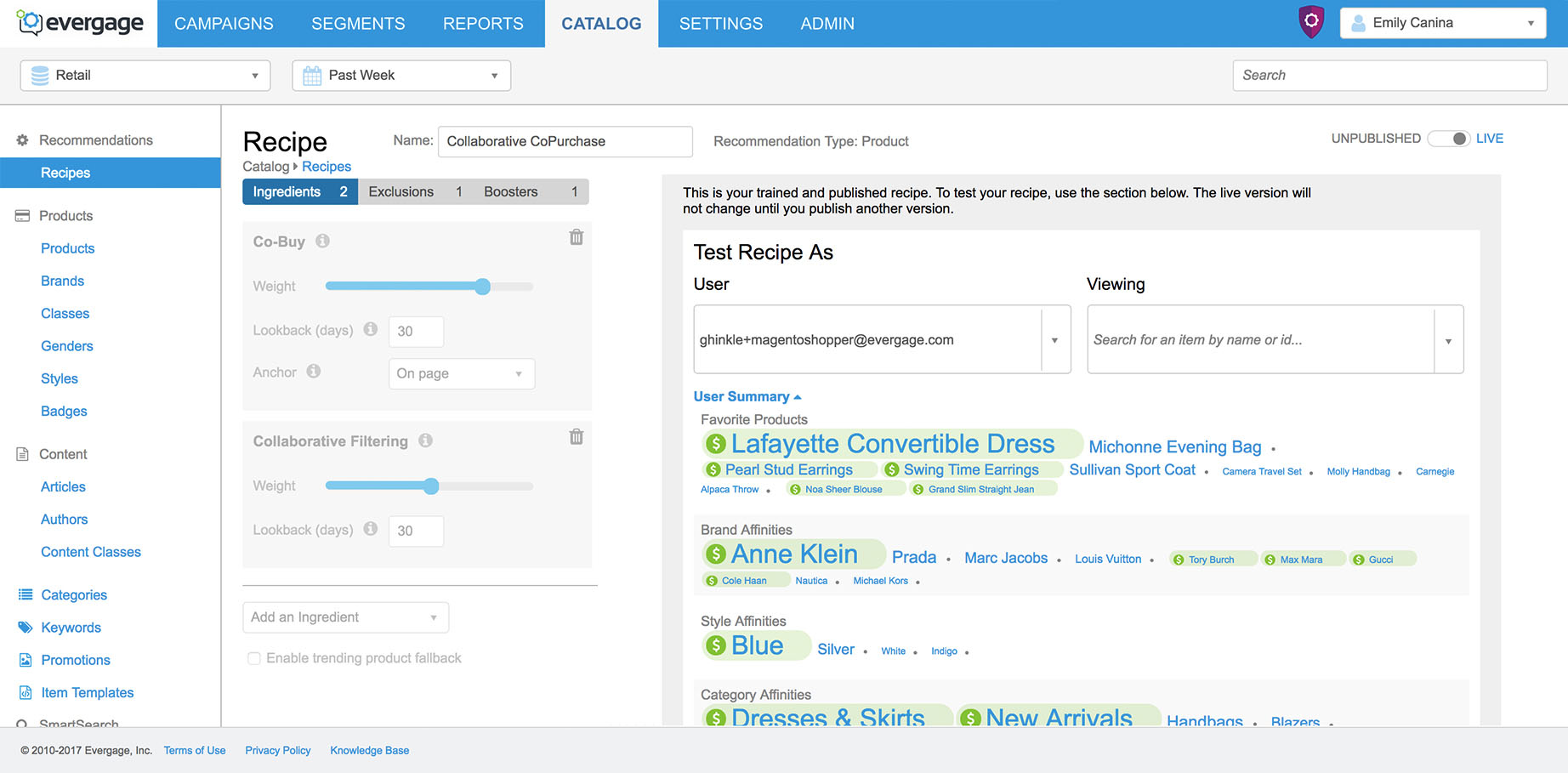
There was a feature in the platform that created basic "out of the box" alogorithms. To create and test custom complex algorithms the Evergage Engineering and Support teams used internal tools and work arounds.
Users:
VIP Clients using Evergage for comple and the same way x algorithms.
Standard Clients using Evergage for basic or "out of the box" algorithms.
Problem: In order for a large prospect to convert, their teams needed to be able to create and test custom complext algorithms in the platform.
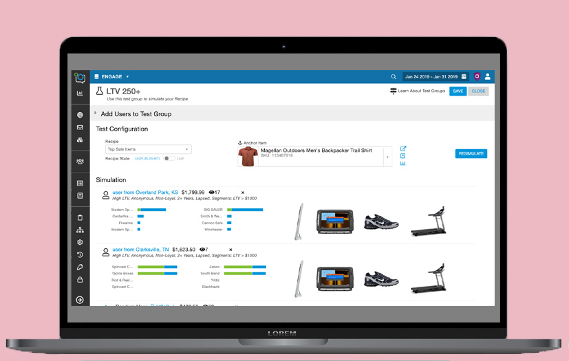
Goal: To automate the algorithm testing process by adding advanced functionality to Evergage’s algorithm testing tool (AKA Recipe Simulator Feature).
Hypothetical Measure of Success:
- Reduced number of errors in campaigns using the algorithms
- NPR survey for client satisfaction
- Reduced time it takes for a client to test an algorithm
Impact
- The above mentioned prospect signed (huge financial impact).
- Support, Internal Data Scientists, + Clients confirmed the goal of creating a more effective and deeper testing deeper was achieved.
- Verbal feedback suggested that the feature was useful for current clients and internal support teams.
- Verbal feedback from the Customer Success team and Director of Learning that there was a boost in moral because they felt prepared and in the loop.
- The Sales Team reported that the new functionalities and UI made it easier for them to showcase Evergage's value to prospects.
Context: Evergage provided advanced machine learning for businesses to recommend products, categories, and other content to personalize their visitors’ experiences. The recommendations can be customized with a variety of settings such as trending, show similar items, user affinities, or specific brands or categories through the creation of “recipes.” The recipes are added into our campaigns to personalize recommendations. Recipes must be tested to ensure they were set up properly and working correctly.
My Role
Product Designer, Project Lead
The Team
Myself, 2 Engineers, CTO, UX Director, Data Scientists, Director of Learning and Development.
Methods
Interaction design, user flows, collaboration, initiative, leadership, visual design
Tools
Axure RP, White board, Evergage, Jira, Google Docs
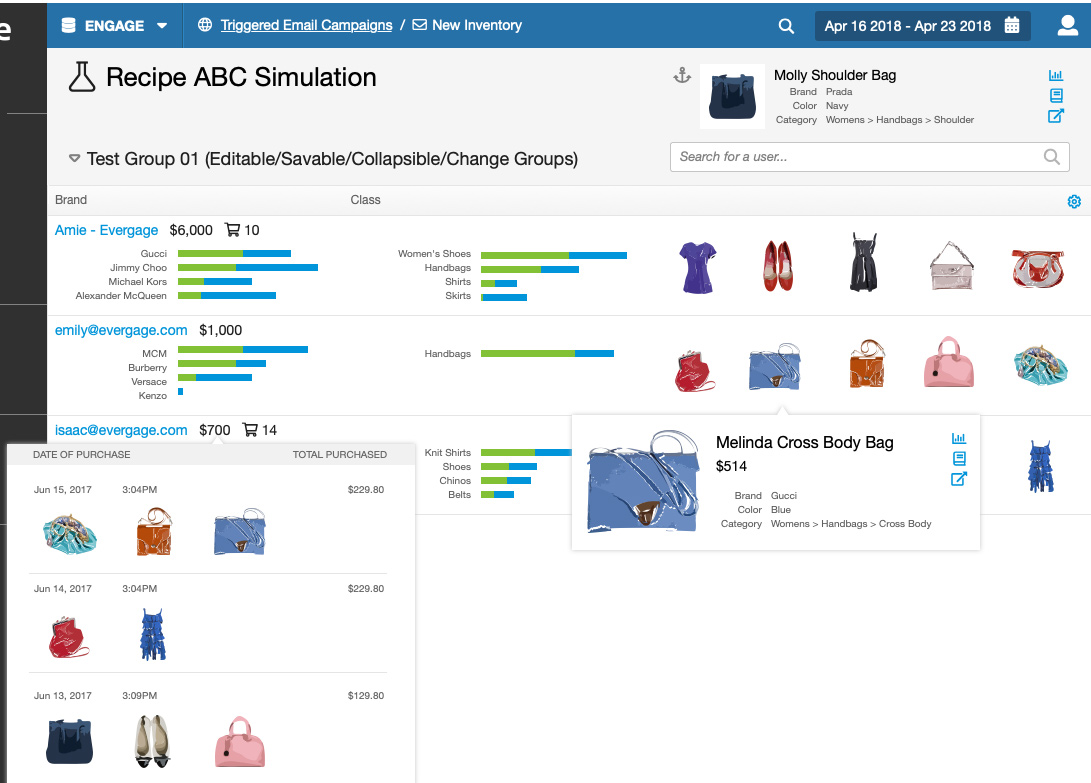
Feature Before
Feature After

How it Started
The CTO, executive team, and Engineers created the requirements, rough sketches and functionality based on the needs of the prospective client and how it currently worked for the interal process.
This project was initially led by our UX Director. She had transferred the CTO's sketches into Axure. During our team design reviews I had provided the feedback that the main user flows were not accounted for in these designs.
The designs were handed off to the two engineers to start building. The UX Director went on vacation and I was temporily the design lead for the project while she was away.
Houston, we have a problem!
The engineers noticed the major gaps in the feature and asked me to clarify. I suggested a few band-aids and mentioned that to truely clarify, we'd have to go back to the whiteboard which would take a ton of time that neither of us had. I was focused on current high impact projects and this project was due yesterday (#startup life). It would have to be fine because it was only internal users.
Plot twist - I was informed that this feature would in fact be released to ALL users, internal and external.
At that point, I used Evergage on Evergage data to check the screen usage. It turns out that 50 users regularly used the screen and a portion of them were important users. I went to the CTO and highlighted the major UX problems, the usage data, and proposed a new plan that would add a week to the timeline and move me from my other projects to focus on this one.
With the engineers we discussed technical implications, business impact, and user impact. He approved my request.
Initial Designs (Dropdown Closed)
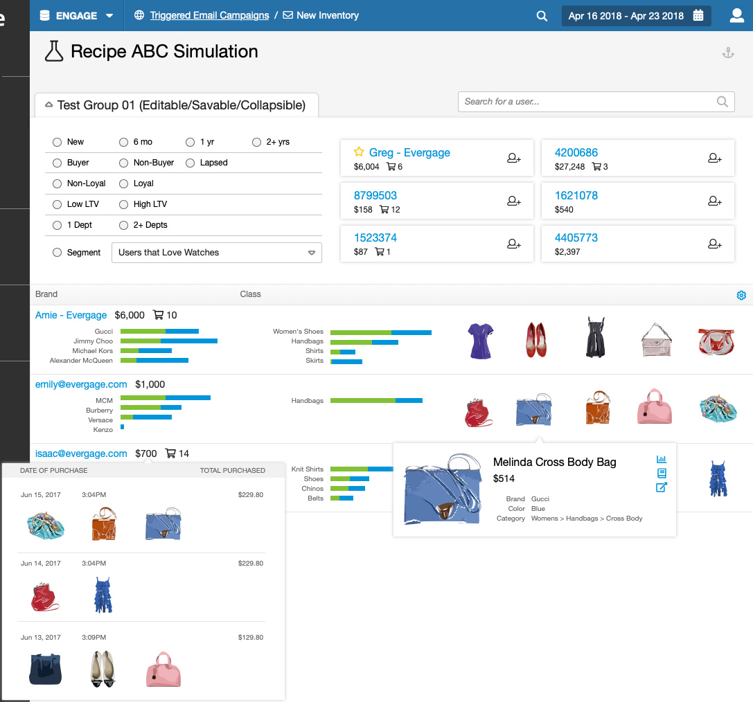
Initial Designs (Dropdown Open)
Ideation + Whiteboarding
The engineers and I went back to the whiteboard. This was a highly interactive screen with new concepts and behaviors. There were some major structural requirements and concepts that weren’t defined, which left holes in the design and the experience. For example, the relationship between a test group, adding a user, and the recipe. In addition to showing it in the UI, I helped refine the feature and how it worked.
We collaborated and wireframed a modified solution that would account for the user flows, interactions, and define the relationship between the new concepts. The engineers were very helpful to address the technical limitations and I helped them understand the user requirements.
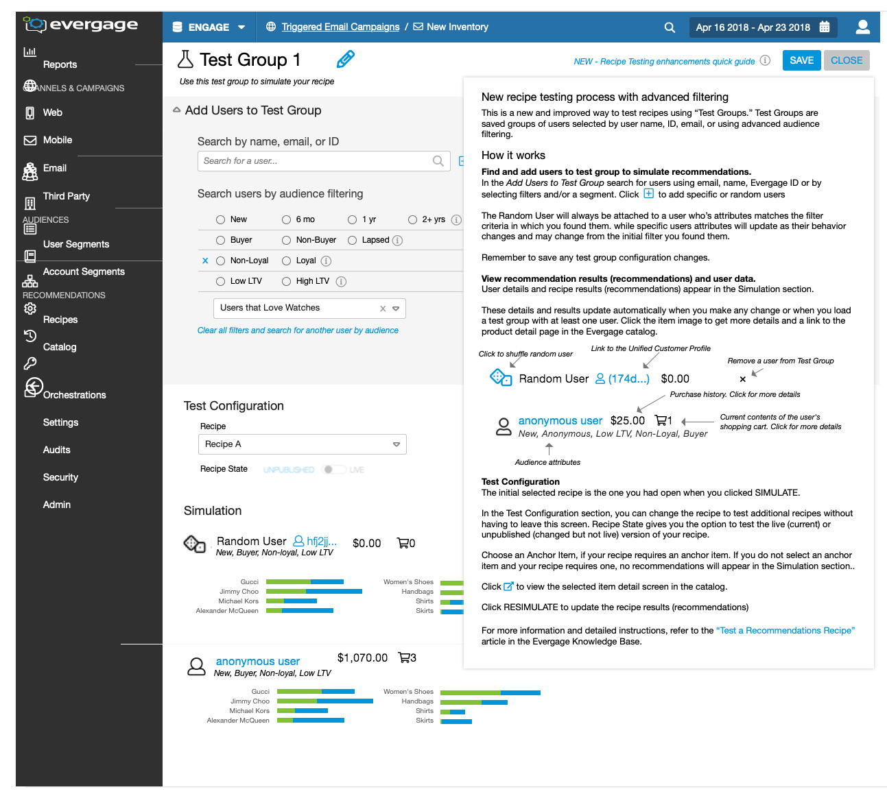
This is a new concept and it's critical that the user has the support to understand how to use the feature. We determined what needs to be intuitive and then added support including helper text, callouts with more information, and support docs.
Examples of Use cases / Interaction
- How do you add / edit / delete a rule
- How do you add / edit / delete a test group
- How do you create your first algorithm
- What does it look like when nothing is created?
Marked Up to Show the Changes
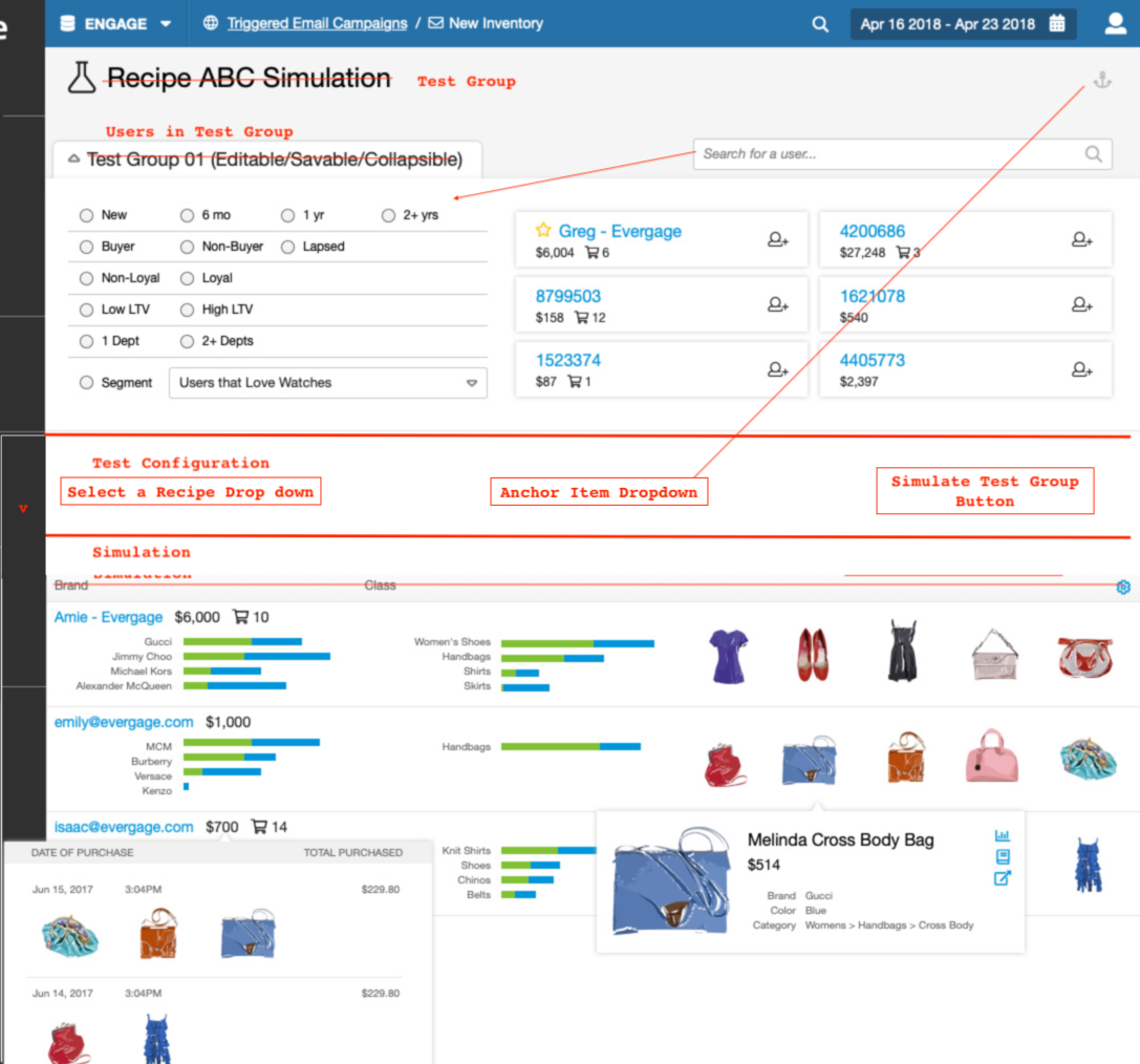
DOCUMENTED THE FEATURE & ADDED ORGANIZATION
I created a working feature requirement doc in Google docs for the team which contained all the requirements, definitions, questions, user flows, and eventually the burn down list. It was essential to document and stay on the same page, especially because we were on a tight time schedule. The three of us met for an additional daily team scrum to sync up.
Updated Designs
I modified the design files created by the UX Director in Axure to reflect the new wireframes. The clean files allowed me to quickly make the modifications.
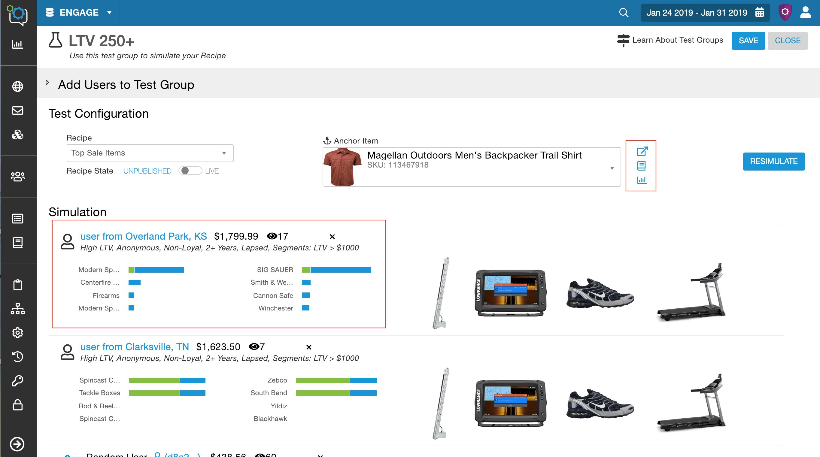
I worked on my design check list and improved the visual design. This included checking that the elements and styles were consistent, i.e the “add user” icon was the same for both random and specific user, as well as check the hierarchy and spacing. Then moved to the smaller interactions like the different hover states, deleting a user, deselecting a filter, etc. Highlighted in the designs are some of the specific interaction areas I focused on and enhanced.
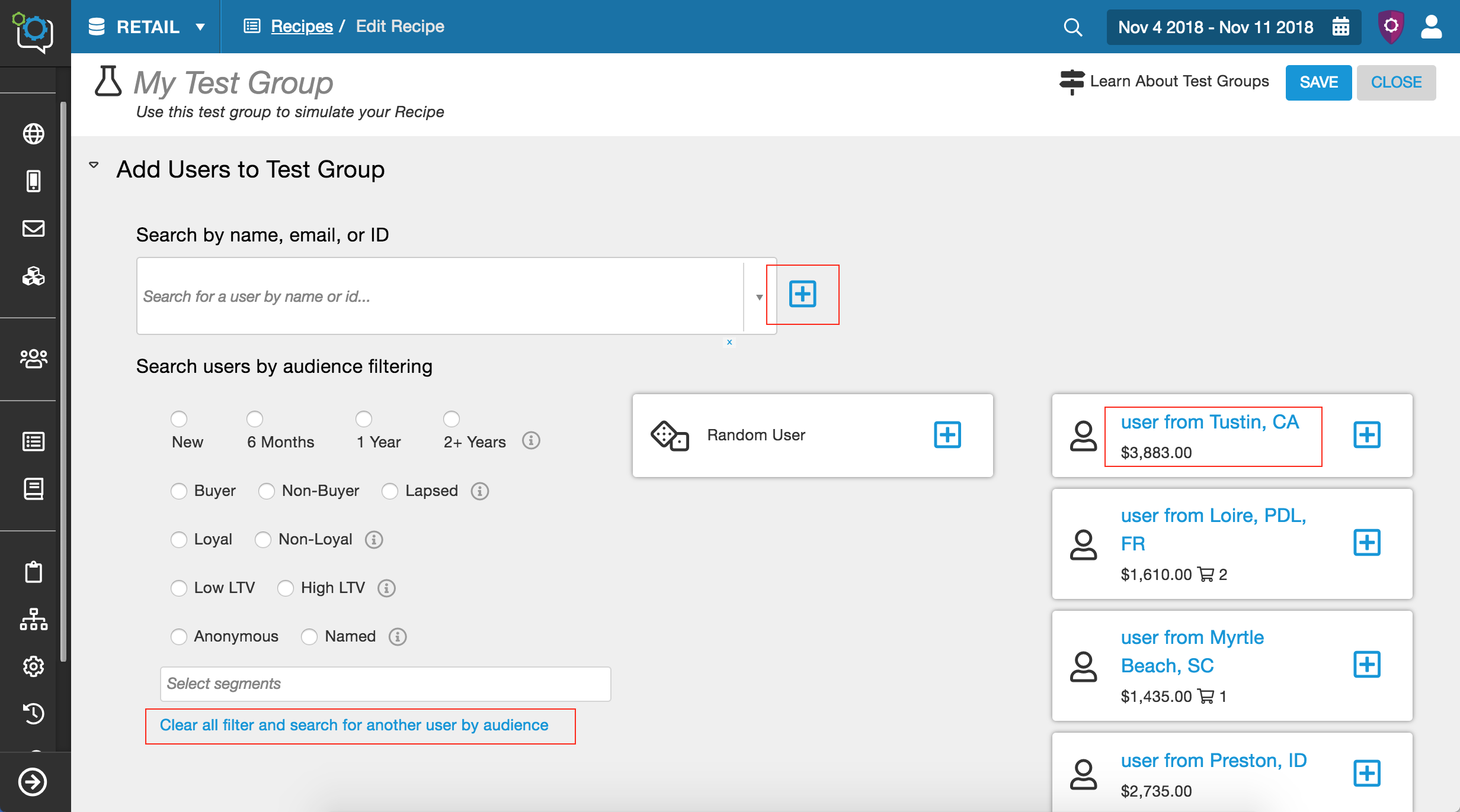
Implementation Collaboration
I handed off the designs to the two engineers. One focused on the back end and the other on the front end of the feature. I worked closely with both, especially the front end dev. This was a very interactive screen and with little time I had to hand over the designs with enough of the interactions accounted for. While they were building I was working through some of the known outstanding interaction questions, and was available for support as they discovered new interaction issues.
The Feature Release Plan
This was an impactful feature and a drastic change which meant that the Customer Success team really needed to prepare to talk to their clients and the users needed to have support. Communicating releases has been a pain point between the departments and is something I’ve worked on improving.
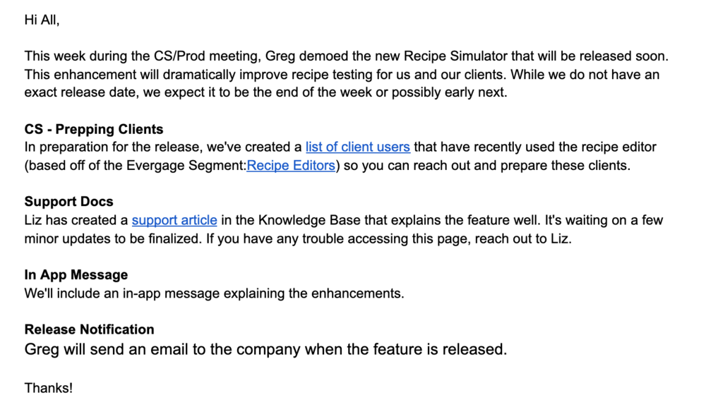
For this project I took advantage of leading the project and implemented a successful release plan. This included working with the the Director of Learning to produce adequate support documentation, communicating with the Customer Success through email and quick updates in team meetings to keep them apprised of the changes and the shifting release time line, and working with the CTO to add an informational tour and in app message explaining the feature.
