Wine App MVP
VINOBLY - B2C WINE RECOMMENDATION APP
Project Descriptions
When I joined the project the mobile app was being built on the backend, the first version of the screens were designed only for mobile, and a visual designer had just finished the style guide with a refreshed look.
I was hired to design the user flows, design new screens to fill in the gaps, move the existing screens to the new style, and work with the frontend developer to bring the designs to life.
The Goal: To create a successful user experience and designs for mobile and desktop.
Role: UX Designer
Team: Founder, Frontend developer, team of back end developers
Skills: UX Design process, wireframing, sketching
Tools: Sketch, POP app, paper prototyping
Impact: Created a useable app for launch
• Redesigned all existing and additional screens in Sketch using new provided style guide
• Created a new and improved user flow for the Vinobly responsive web app
• Worked closely with the founder including many white boarding and brainstorming sessions
The Story
The Vinobly app was a wine recommendation startup app that launched in the fall of 2014 and is currently off the market. Check out this BostInno article for more info about the company.
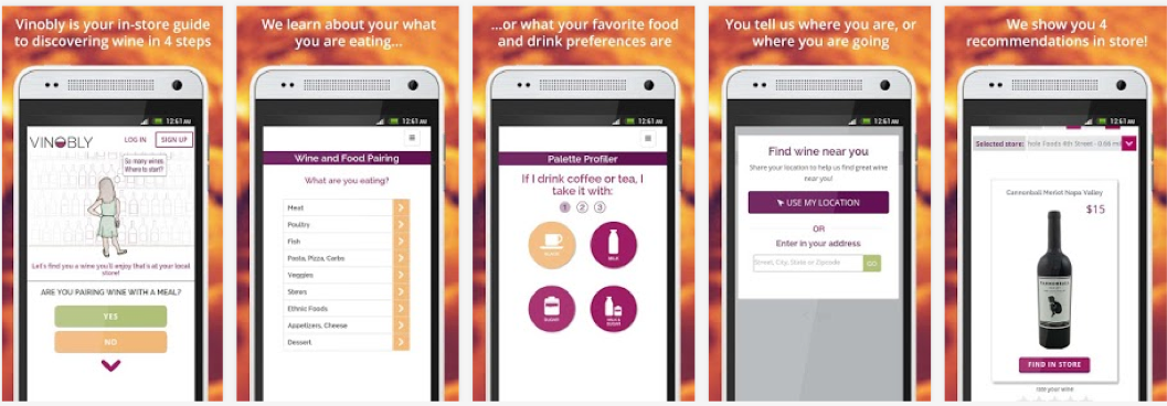
The purpose of the app was to make it easier for people to find wine they enjoyed by asking the user simple questions about their taste palette, like coffee vs tea or orange juice vs apple juice, that would translate to the type of wine they would like best.
1. Identify the Users & Use Cases
To start the process the Founder and I talked and identified the primary users and the main use cases. We used her vision for the app, her market research, our own experiences as wine drinkers, and empathy. With limited resources and a running time clock we had enough evidence without validation to move forward.
Primary users: people with limited to moderate knowledge of wine.
Main use cases: 1) people who were either looking for a bottle of wine to drink and 2) people who were looking for a bottle of wine to pair with a specific meal.
2. User Flows
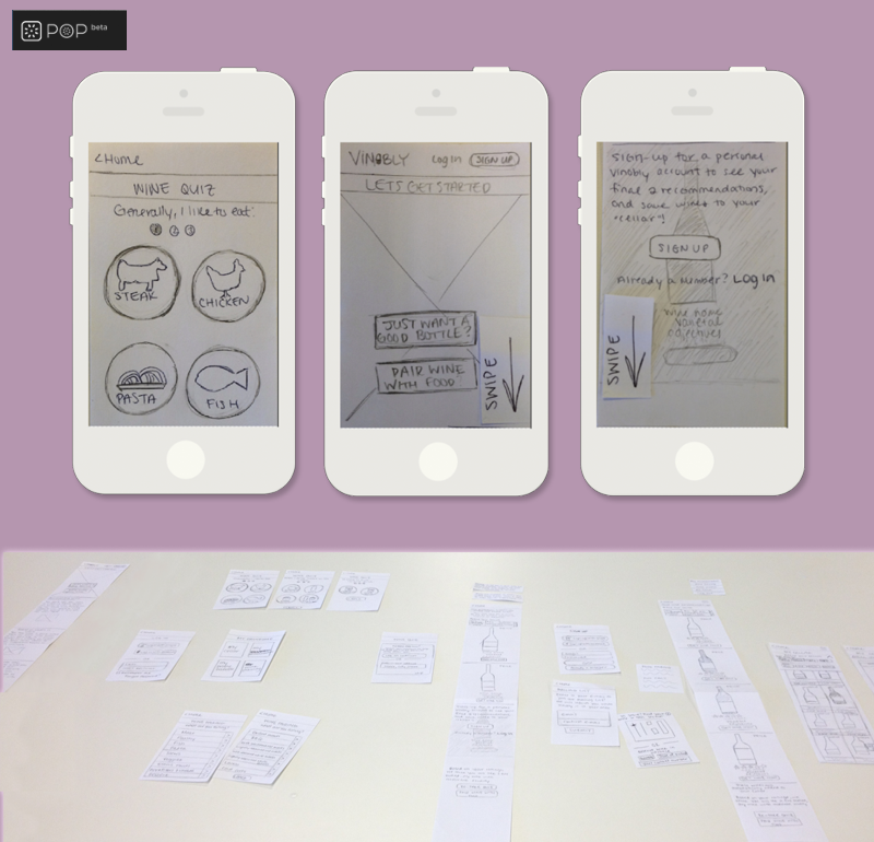
I sketched the existing screens on index cards and added new screens based on the two use cases. The founder and I discussed and solidified the new user flows for both use cases and ensured that it matched her vision for the app and the users hypothetical intention.
A challenge that arose was how to handle finding the users’ geography location. At the time, this wasn’t as streamlined as it is now, and the recommendation model wasn’t scaled yet. How it worked was the Founder went into each liquor store and mapped out where each wine bottle was located so that the user could find the desired bottle. The wine recommendations were only in a select number of stores in the Boston and Cambridge area. We solved this by informing the user early so they wouldn’t get too frustrated if their location wasn’t one of the selected and gave them the option to the on the waitlist and we’d reach out when their location was added.
3. User Testing
I conducted a user study using the POP app which helped identify important functionalities that were missing and improve the user flow. The participants were other people in the coworking space who volunteered their time. For the test I asked them to use the app to perform two tasks 1) find a bottle of wine just for drinking and 2) find a bottle of wine for a specific dinner.
These users weren’t screened to see if they were our primary users. This is something I would do differently. There is a significant difference between your users and users. We were able to test human behavior but not the actual behavior of people in those situations.
4. High Fidelity Designs
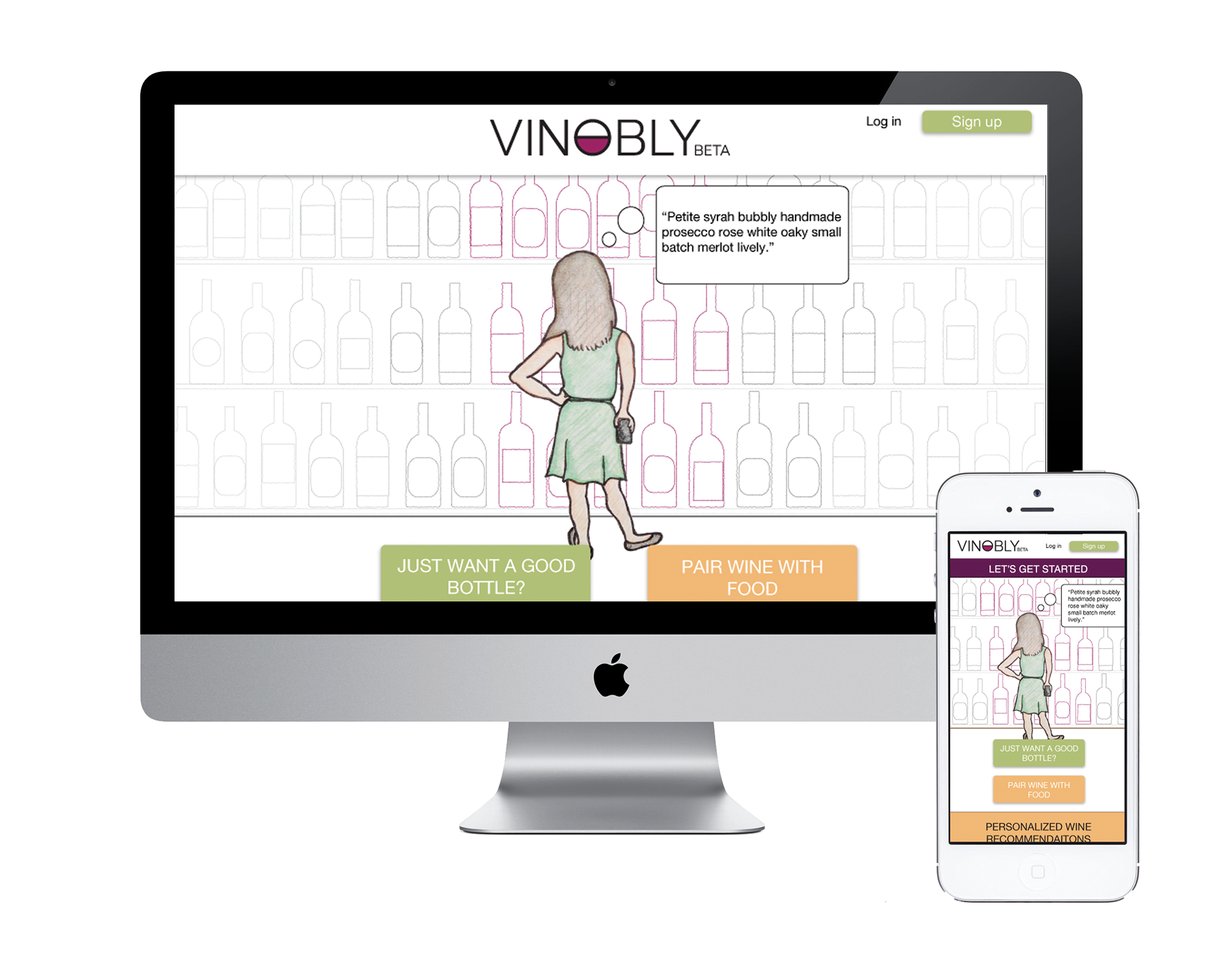
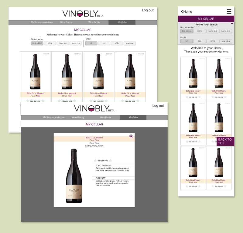
I transferred the sketches into Sketch. I used the style guide provided and ensured the designs were responsive and optimal for mobile and desktop. The app included 15 wireframes for both mobile and desktop.
5. Sketches for Landing Page
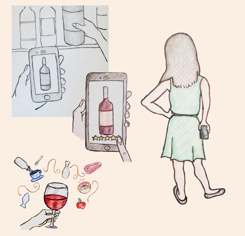
The founder wanted a playful and fun opening to the app. We brainstormed together to determine which images would be successful based on the purpose to the app. It was a fun addition because I had the opportunity to draw the images free hand, which I love to do. I used photoshop and illustrator to edit and enhance the images.
Final designs Live
